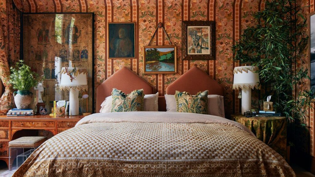
The first step in creating a color-drenched bedscape is to select a foundation color, or what Jasmine Artis—owner and principal designer of Chicago-based J’Miracle Designs—likes to call the “anchor color.” In her eyes, this helps keep the mix of colors grounded—no matter the accents introduced to the design scheme. “Choosing a dominant hue, such as on the duvet or quilt, sets the mood,” she says. “This could be a soft neutral for a calming look or deep tone for a more dramatic look.”
As an alternative, Apelian often starts with a tailored, neutral sheet set as the foundation, “then layers in a textured or subtly patterned duvet for depth and dimension.”
Keep the color palette cohesive
Prestige Real Estate Images, Inc
Next, work within a color family to keep the palette cohesive. The key is to match the dominant color with a range of complementary undertones, which creates harmony even if the colors on the bed are different. If you lean towards a warm color palette, consider a dominant color like yellow or orange and match it with matching undertones like terracotta. Or, if you choose a cool, moodier dominant color like a deep green or blue, match it with jewel undertones like sapphire.
“Layering always dresses a bed well,” Artis adds. “I love introducing secondary colors through shams, throw pillows, or blankets in addition to textures like velvets or knits.”
Use pattern as the unifier
Summer Thornton’s personal Chicago residence designed by Summer Thornton. Primary bedroom features a layering of feminine patterns from around the world.Summer Thornton Design Inc


